Good Design Components
Significance
Grids provide the underlying structure of a website. They ensure that elements like images, text blocks, and buttons are aligned and proportional. Without a grid, a design often feels chaotic and unprofessional.
Best Practices
- Use a standard 12 column grid for flexibility across desktop and mobile.
- Maintain consistent gutters (the space between columns) to give content room to breathe.
- Align elements to the grid lines to create a sense of visual harmony.
Improving Visitor Experience
A grid creates predictability. When a user navigates a page where elements are aligned, their eyes can scan the information more efficiently. This reduces the effort required to process the layout.
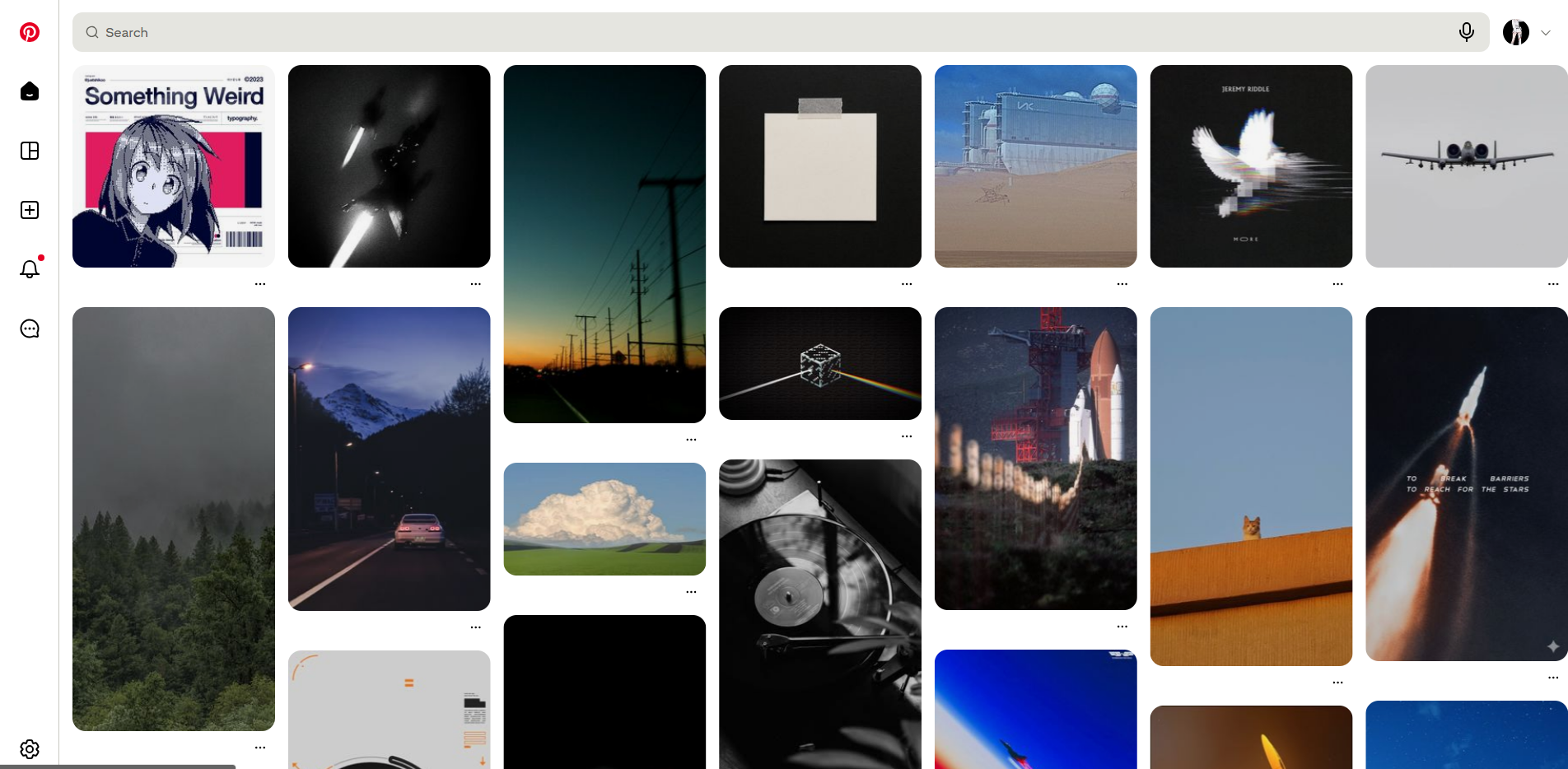
Website: Pinterest
- Why it is Good: Pinterest is a masterclass in the masonry grid. Despite having items of different heights, the vertical columns remain consistent. It allows for a massive amount of content to be displayed without looking cluttered.
Significance
A CTA is the bridge between a user browsing and a user taking action. It is the primary tool for conversions, whether that is signing up for a newsletter or making a purchase.
Best Practices
- Use high contrast colors that make the button stand out from the background.
- Write action-oriented text like Get Started or Join Now instead of generic words like Submit.
- Place CTAs in prominent areas, such as the top right of the header or the center of the hero section.
Improving Visitor Experience
Clear CTAs remove ambiguity. A visitor should never have to wonder what they are supposed to do next. A well designed CTA provides a clear path forward, reducing frustration.
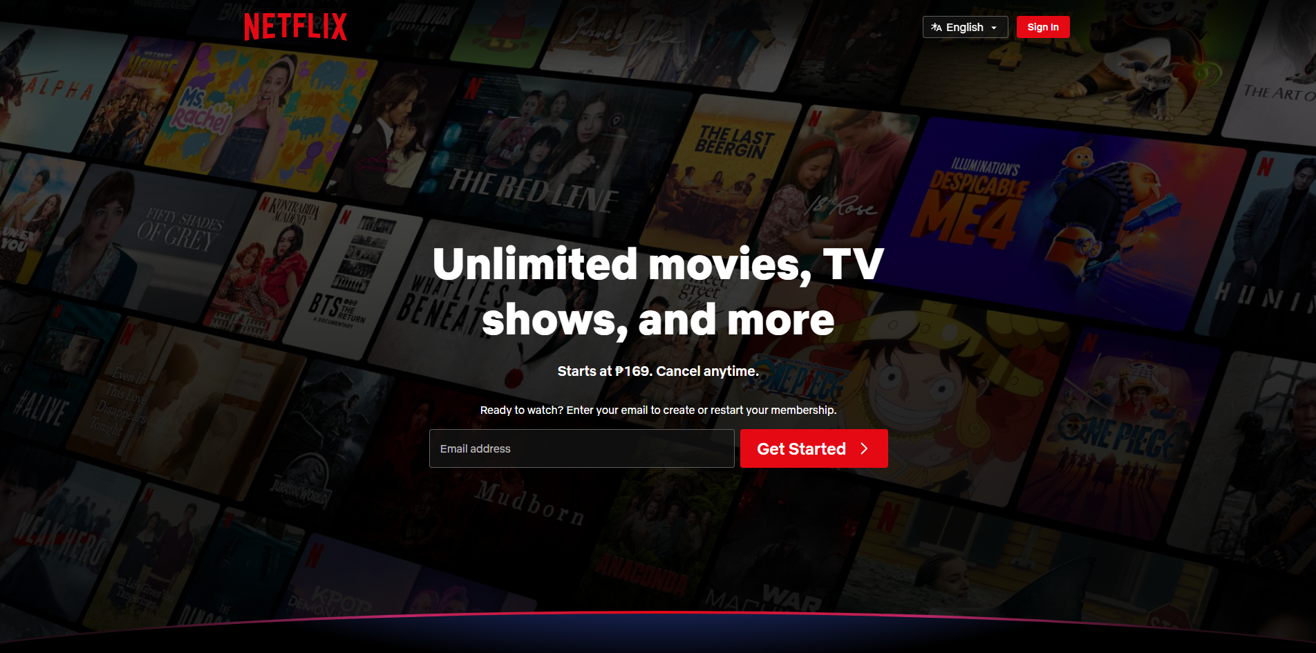
Website: Netflix
- Why it is Good: Their landing page is focused almost entirely on one CTA: Get Started. The bright red button on a dark background is impossible to miss, and the language is direct and inviting.
Significance
Breadcrumbs are secondary navigation schemes that reveal the user's location in a website or web application. They are essential for sites with deep hierarchical structures.
Best Practices
- Use them as a supplement to, not a replacement for, the primary navigation menu.
- Use a simple separator like a greater than symbol (>) or a slash (/).
- The current page should be the last item in the breadcrumb and should not be a clickable link.
Improving Visitor Experience
Breadcrumbs allow users to understand where they are within the site hierarchy. They provide a "one click" way to navigate back to higher level categories, which is much faster than using the back button repeatedly.
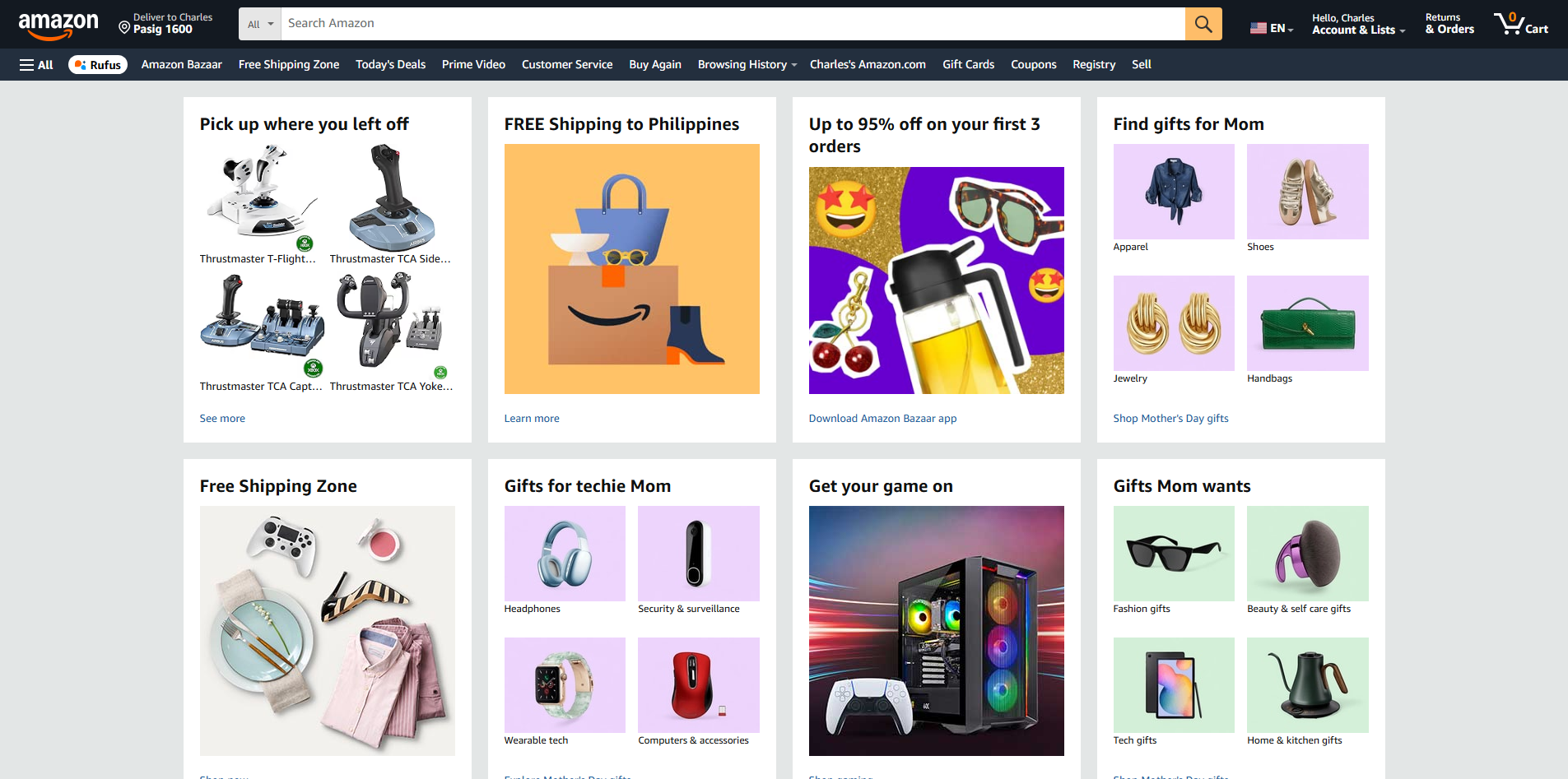
Website: Amazon
- Why it is Good: When browsing products, Amazon uses breadcrumbs to show exactly which category and subcategory you are in. It makes it easy to jump back to a broader category to continue shopping.
Significance
For many users, the search bar is the primary way they interact with a site. It is a shortcut for those who know exactly what they want and do not want to click through menus.
Best Practices
- Make the search bar visible and easily accessible, typically in the top right or center of the header.
- Include a magnifying glass icon, which is the universal symbol for search.
- Use placeholder text like Search for products... to guide the user.
Improving Visitor Experience
It saves time. By providing a direct route to specific content, the search bar empowers the user and makes the site feel more responsive to their needs.
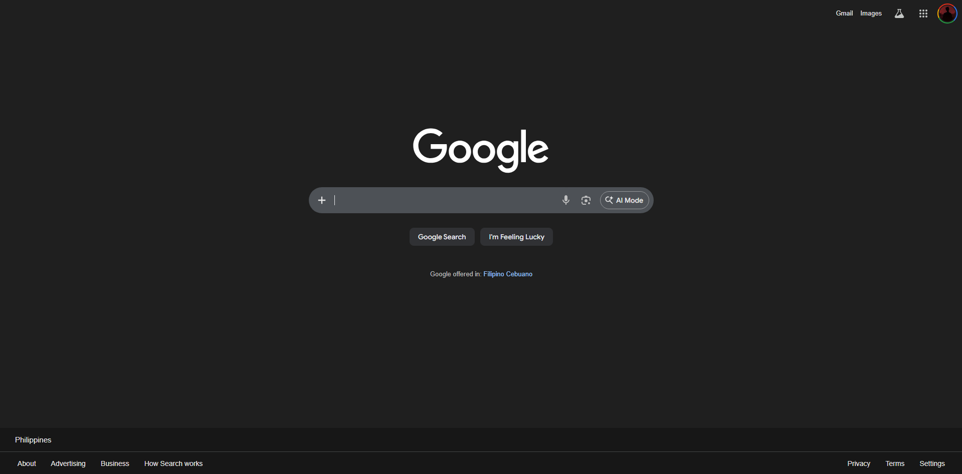
Website: Google
- Why it is Good: The search bar is the entire focus of the page. It is simple, clean, and functional. There are no distractions, ensuring the user achieves their goal immediately.
Significance
Icons are visual metaphors that help users navigate an interface. They save space and can bridge language barriers by using universal symbols.
Best Practices
- Use recognizable icons (e.g., a house for home, a gear for settings).
- Keep the style consistent (e.g., all outlined or all solid).
- Pair icons with text labels when the icon's meaning might be ambiguous.
Improving Visitor Experience
Icons act as visual cues that the brain processes faster than text. They make the interface feel more intuitive and modern while helping to organize content visually.
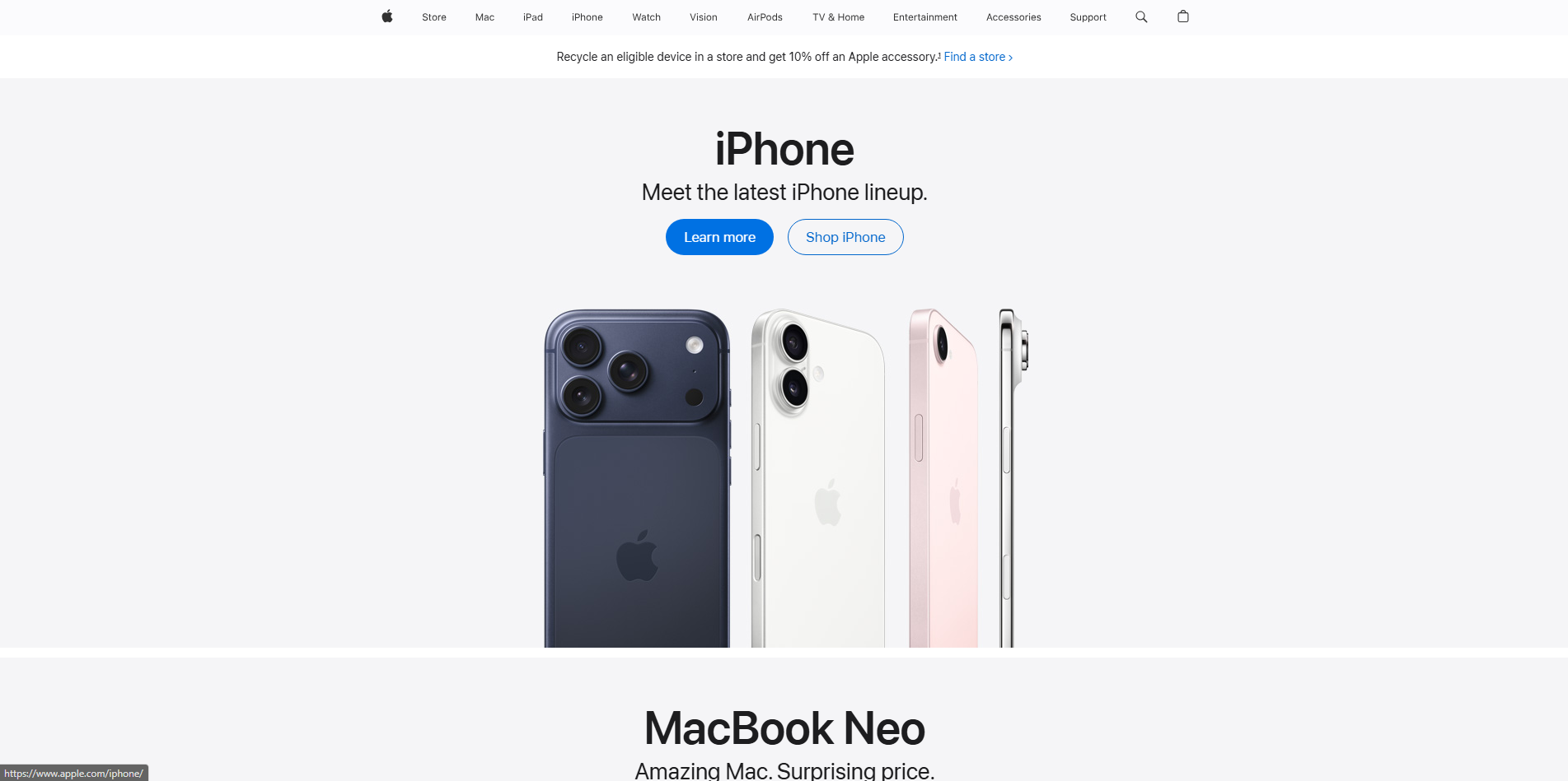
Website: Apple
- Why it is Good: Apple uses minimalist, highly polished icons that are consistent across their entire ecosystem. Their meaning is immediately clear, contributing to a premium feel.
Significance
A modal is a window that appears on top of the main page content, requiring the user to interact with it before they can return to the main site. It is used to capture attention or request specific information.
Best Practices
- Provide a clear and easy way to close the modal, such as an X button in the corner.
- Dim the background content to keep the focus on the modal.
- Use them sparingly to avoid annoying the user.
Improving Visitor Experience
Modals are effective for keeping the user in the same context. For example, a login modal allows a user to sign in without being redirected to a completely different page, maintaining their flow.
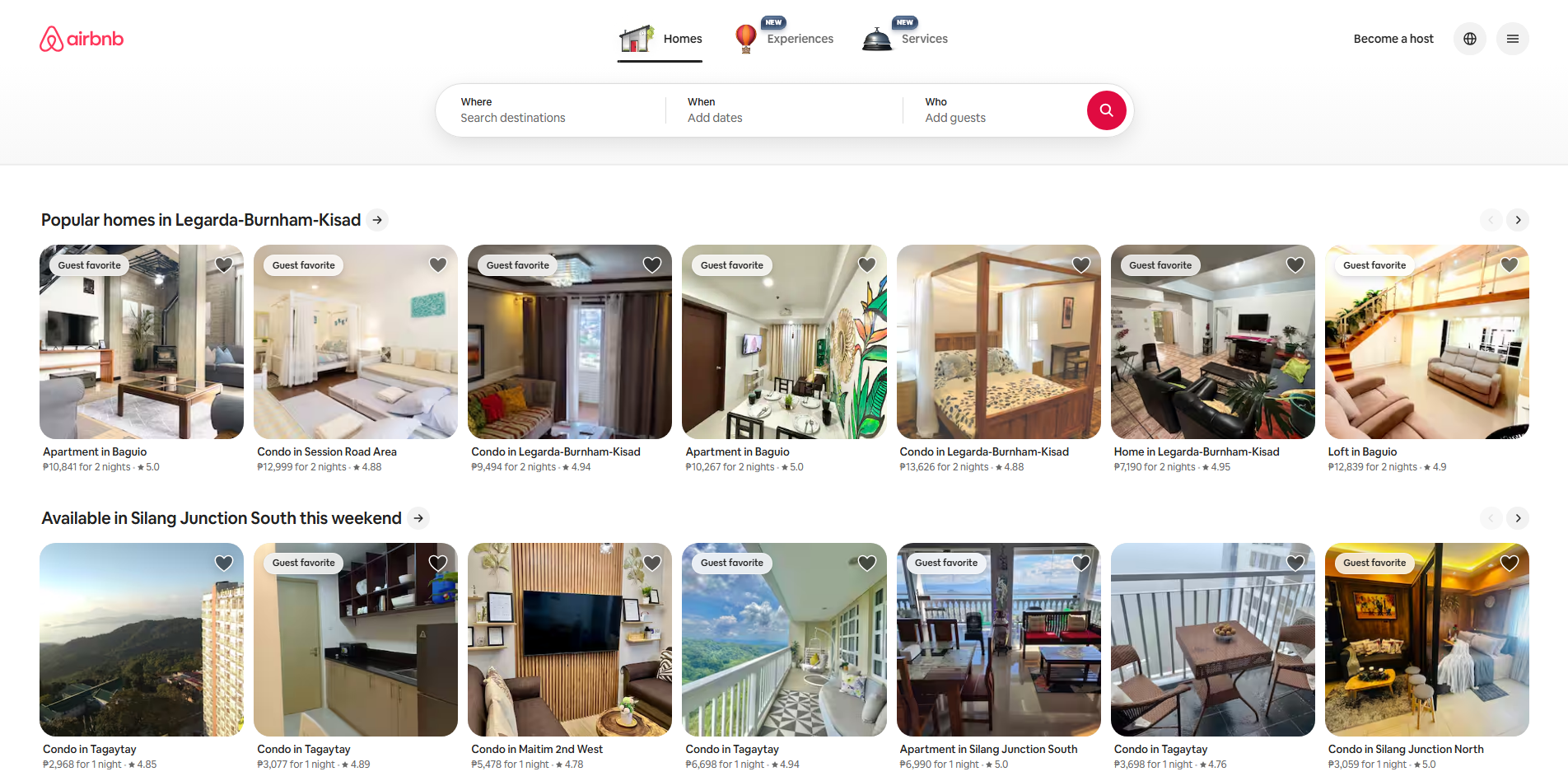
Website: Airbnb
- Why it is Good: Their login and signup modals are clean and centered. They dim the background effectively, making it clear that the user needs to complete the login task before continuing.
Significance
Typography is more than just picking a font. It involves the arrangement, size, and spacing of text. It defines the voice of the brand and ensures content is readable.
Best Practices
- Limit the number of different fonts to two or three.
- Use a clear visual hierarchy (e.g., H1 for main titles, H2 for subheadings).
- Ensure there is enough line height and letter spacing for comfortable reading.
Improving Visitor Experience
Good typography prevents eye strain. If text is easy to read and logically organized, users are more likely to stay on the page and consume the content.
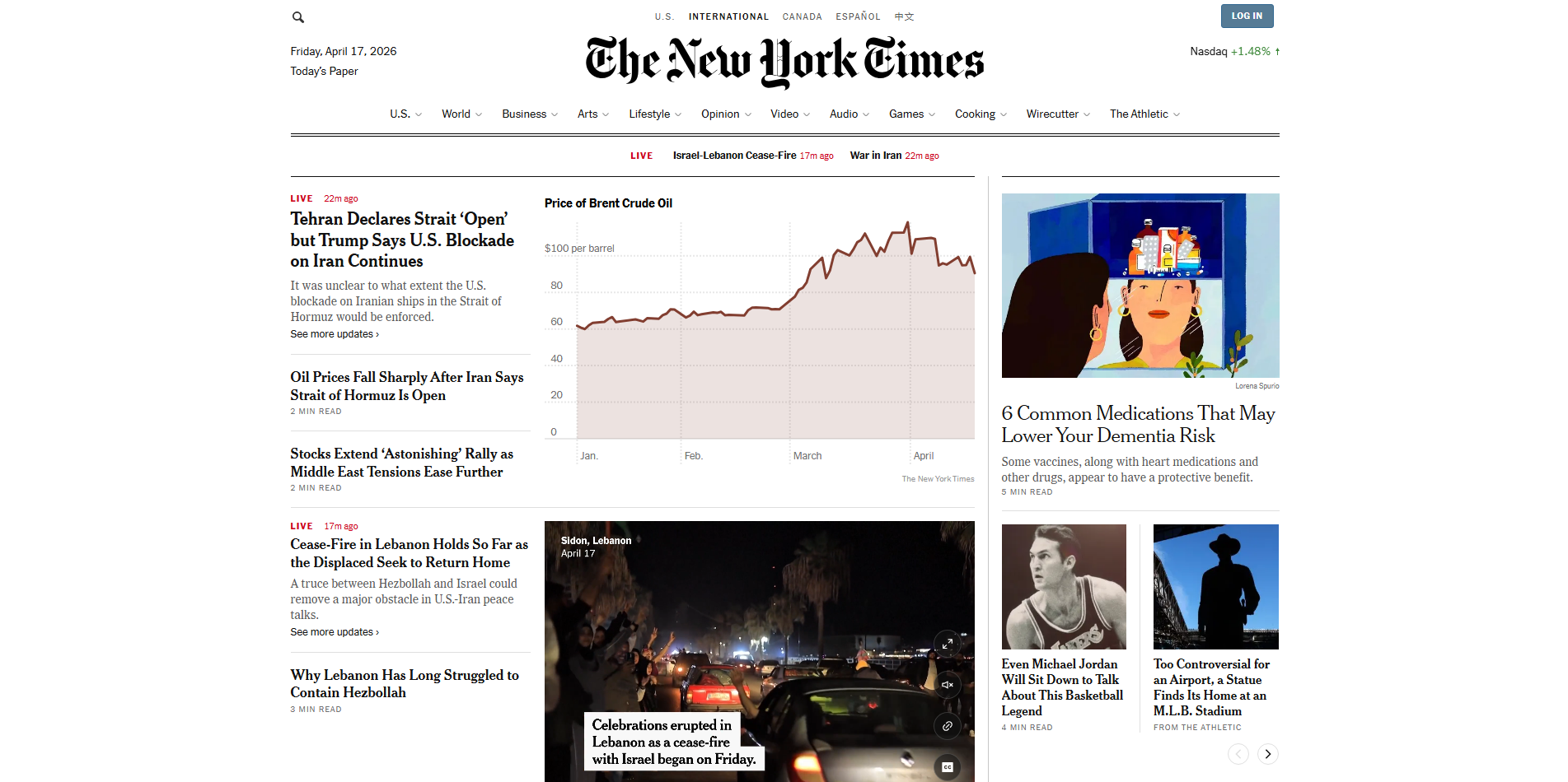
Website: The New York Times
- Why it is Good: They use a mix of serif and sans serif fonts to create a sophisticated, journalistic feel. The hierarchy is perfect: you always know what is a headline versus a caption.
Significance
Colors evoke emotion and reinforce branding. They are also functional tools used to highlight important information or indicate status (like green for success or red for error).
Best Practices
- Use the 60-30-10 rule: 60% dominant color, 30% secondary, and 10% accent.
- Ensure high contrast between text and background for accessibility.
- Use a consistent color palette throughout the site.
Improving Visitor Experience
Color helps guide the user's eye to important areas. It also sets the mood for the experience. A spa website might use calming blues, while a sale site might use urgent oranges and reds.
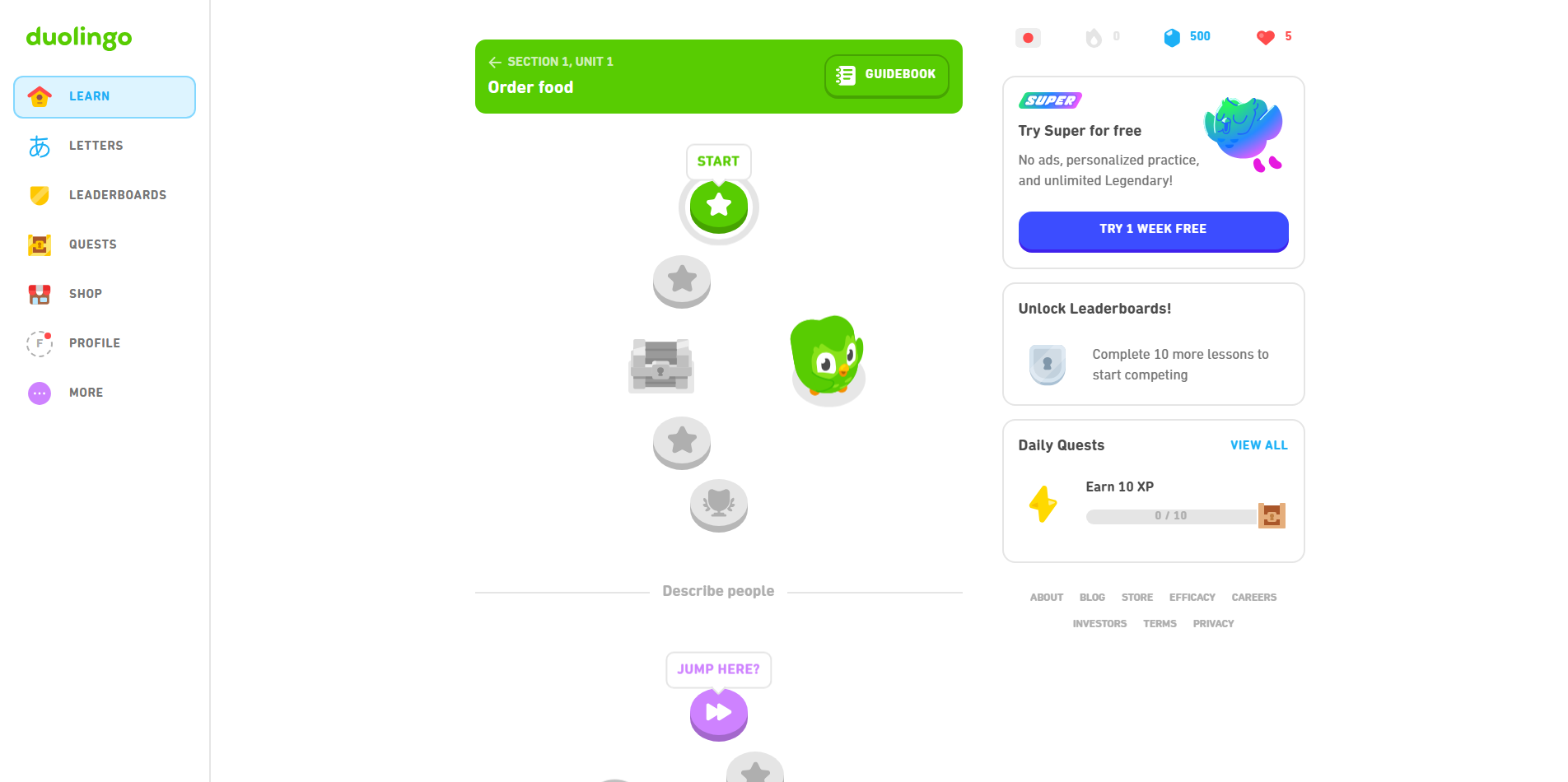
Website: Duolingo
- Why it is Good: They use a bright, playful color palette that makes learning feel like a game. The colors are consistent across the web and mobile versions, reinforcing their brand identity.
Significance
Usability refers to how easy and satisfying a website is to use. It is the overall measure of how effectively a user can achieve their goals on the site.
Best Practices
- Keep the design simple and intuitive.
- Ensure the site is responsive and works well on all devices.
- Minimize the number of clicks required to reach a goal.
Improving Visitor Experience
High usability leads to high satisfaction. When a site works exactly how a user expects it to, they feel competent and are more likely to return.
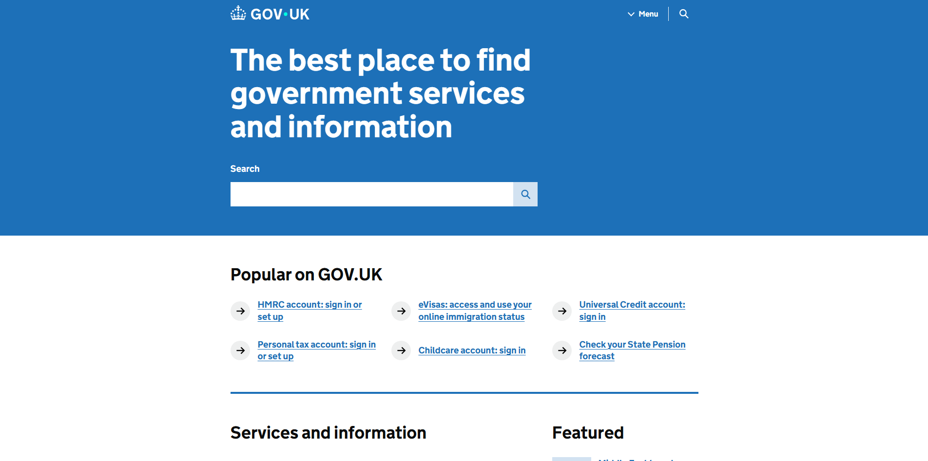
Website: Gov.uk
- Why it is Good: This site is often cited as a pinnacle of usability. It is incredibly plain, but it is designed specifically to help citizens find information and complete tasks with zero distraction.
Significance
Consistency means using the same design patterns, colors, and behaviors throughout the entire site. It creates a cohesive experience and builds trust.
Best Practices
- Use a design system or style guide to ensure all components look and behave the same.
- Keep navigation menus in the same place on every page.
- Use consistent terminology for buttons and labels.
Improving Visitor Experience
Consistency reduces the learning curve. Once a user learns how to use one part of your site, they can apply that knowledge to the rest of the site, making them feel more comfortable.
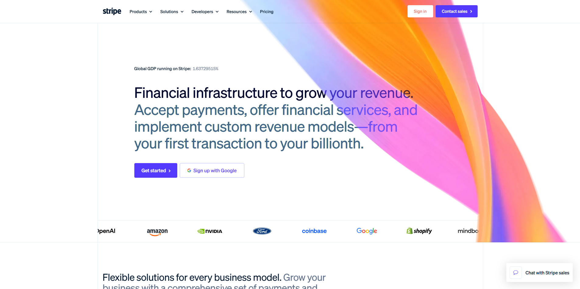
Website: Stripe
- Why it is Good: Stripe's website and documentation are perfectly consistent. Whether you are on their marketing homepage or deep in their technical API docs, the fonts, colors, and button styles remain the same.
Anti-Design — A Case Study
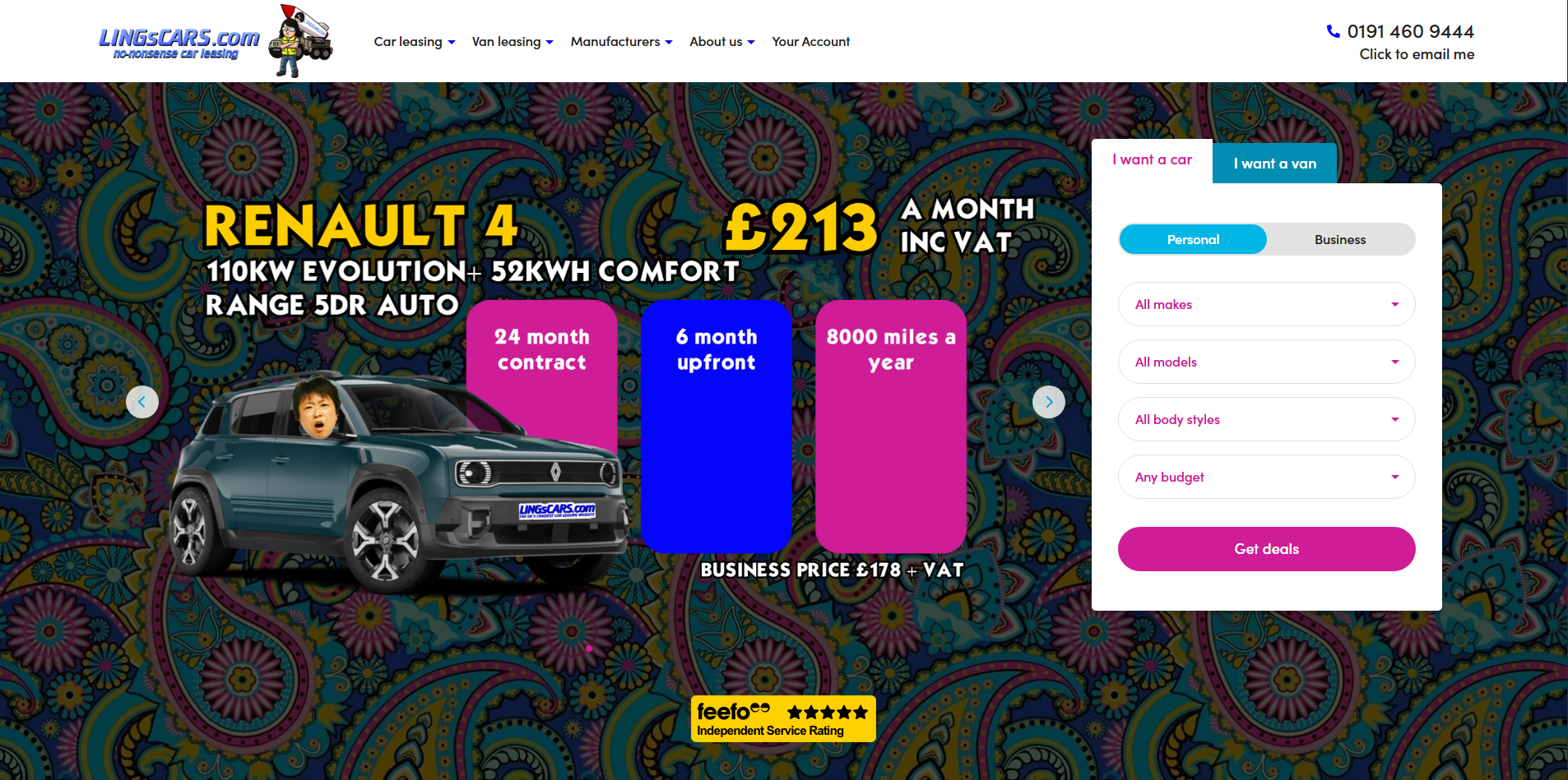
Website: LINGsCARS
- Why it is Bad: This website is a famous example of "anti-design." It breaks almost every rule mentioned above.
- Grids: There is no discernible grid. Content is scattered everywhere.
- Consistency: Every section uses different colors, fonts, and moving animations. There is no cohesion.
- Usability: It is extremely difficult to find specific information because the visual noise is overwhelming.
- Typography: It uses multiple clashing fonts and colors, making it very hard to read.
What makes it "good" in a very specific way is its branding: it is so intentionally chaotic that it has become a cult classic. However, for any standard business, this would be a textbook example of poor design.